This is the second project of a multi design project. For each project we have two weeks to finish it.

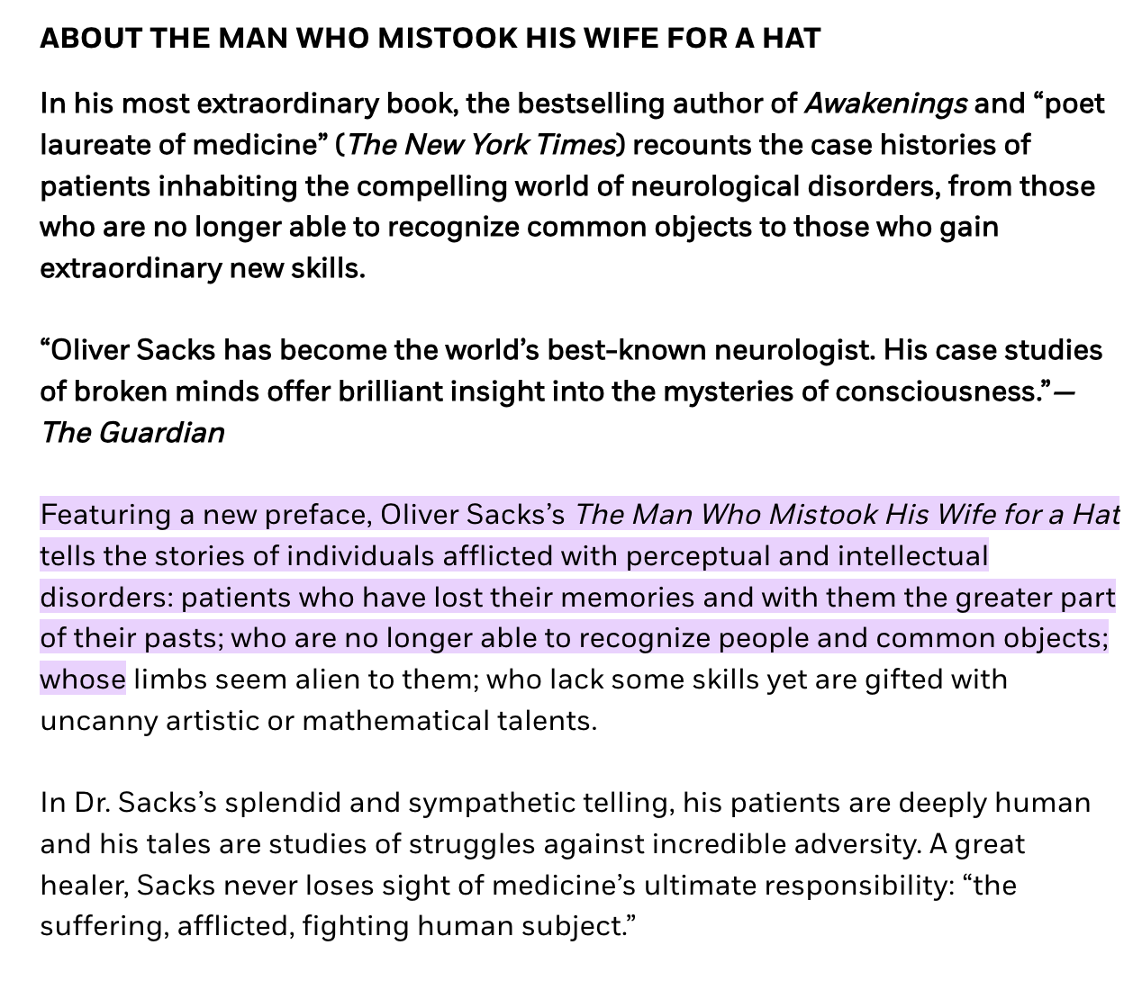
This assignment was to redesign a book cover. The assignment was simple with almost no restrictions. When we got the assignment, I almost knew instantly which book I would redesign. The man who mistook his wife for a hat, Oliver Sacks.
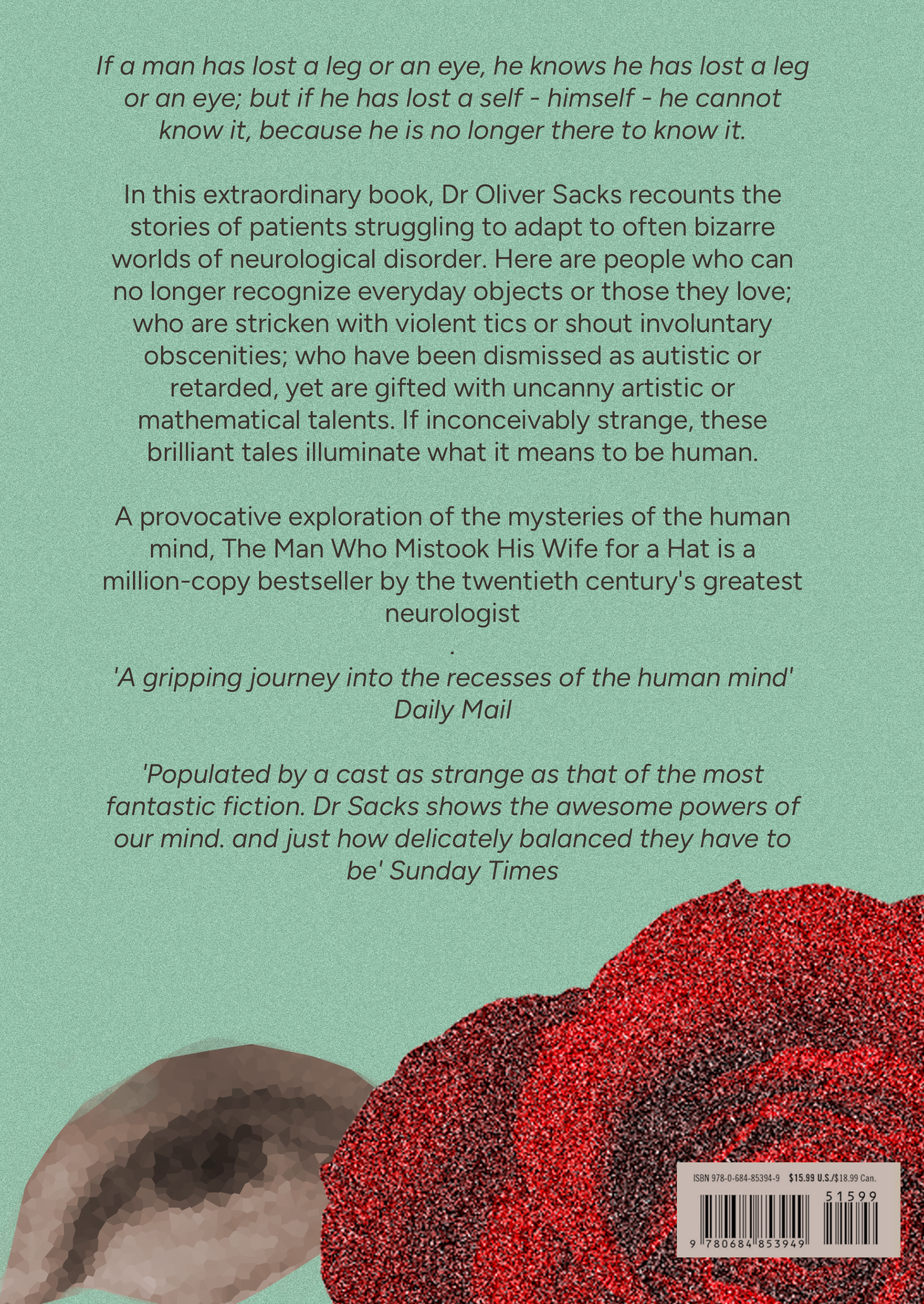
One of the reasons I chose this book is because of how specific mental illnesses are depicted and would give a good base to make something good. Here is a brief summary of the book:
another reason I chose this book is because I think the cover of the book cover, I own could be better. It is quite simple and does not make an homage to the contents of the book. I also decided to challenge myself by giving myself the restriction to use a photo in the book cover. This is because I never did something like that and wanted to learn the skill to do it and to go outside my comfort zone.
One of the first steps I took was to do research. I read the book and made tabs of important scenes, inspiring scenes, and elements that I could implement in my design. I also researched online to see what other people think of the book and what they find important scenes. This was all possible to do with the small amount of time I got for this assignment since the book is a collection of stories, but the story in the title is 28 pages long. If I chose a different book I would probably do even more research online and read more summaries.
(*1 I want to add that i lost the images i took of my notes and sketches. My phone didn't save the images and i don't have the book available)
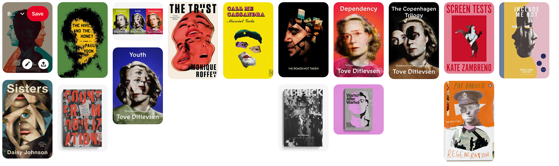
Of the notes I made I created a mood board. Since the story was so short and is about one message and one theme it was not possible to make multiple mood board.
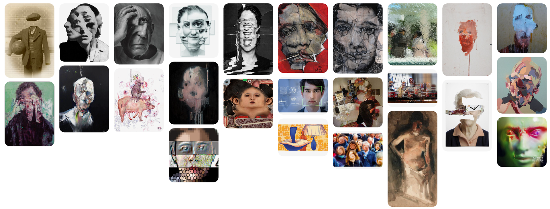
https://pin.it/2SO0QmLbj
I liked that it the mood was almost alien like with a dark undertone. It also fits verry well with the story. While making the mood board I also found some inspiring book covers and saved them.
https://pin.it/4As1Fkwbv
One person was very inspiring to me the way he implements photos, Elisha Zepeda. https://nl.pinterest.com/96ezepeda/
He also makes videos of his design process with multiple prototypes. This process inspired me even more and made designing the book cover more fun.
I also made and style board. Thanks to the images I found I could make this book cover. Mean in a way of that it made me go really out of my comfort zone.
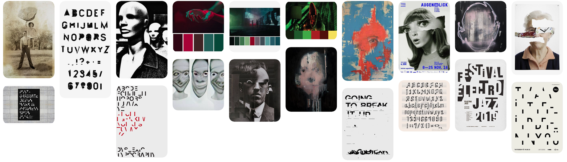
https://pin.it/2jvy4OYDE
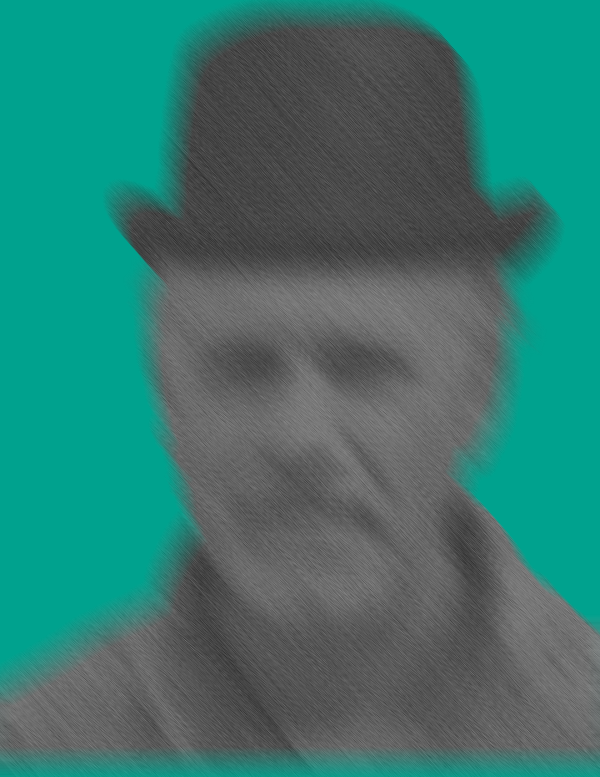
Then it was time to sketch. In my sketches I really focused on composition, how much of the person would be visible and the layout of the text. Since it was a photo seemed it a good idea to sketch and just play with the picture in photoshop.
( referral to *1)
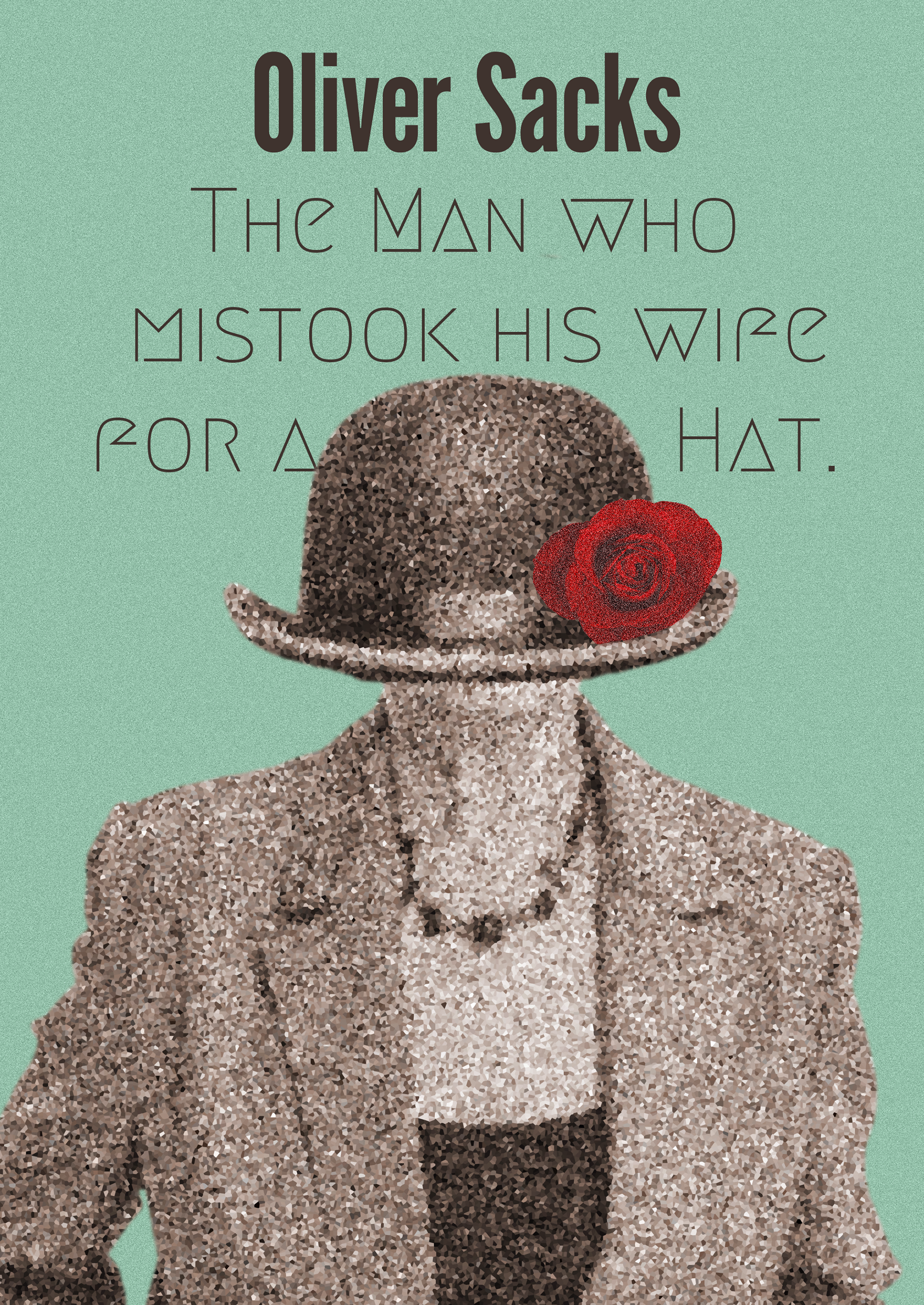
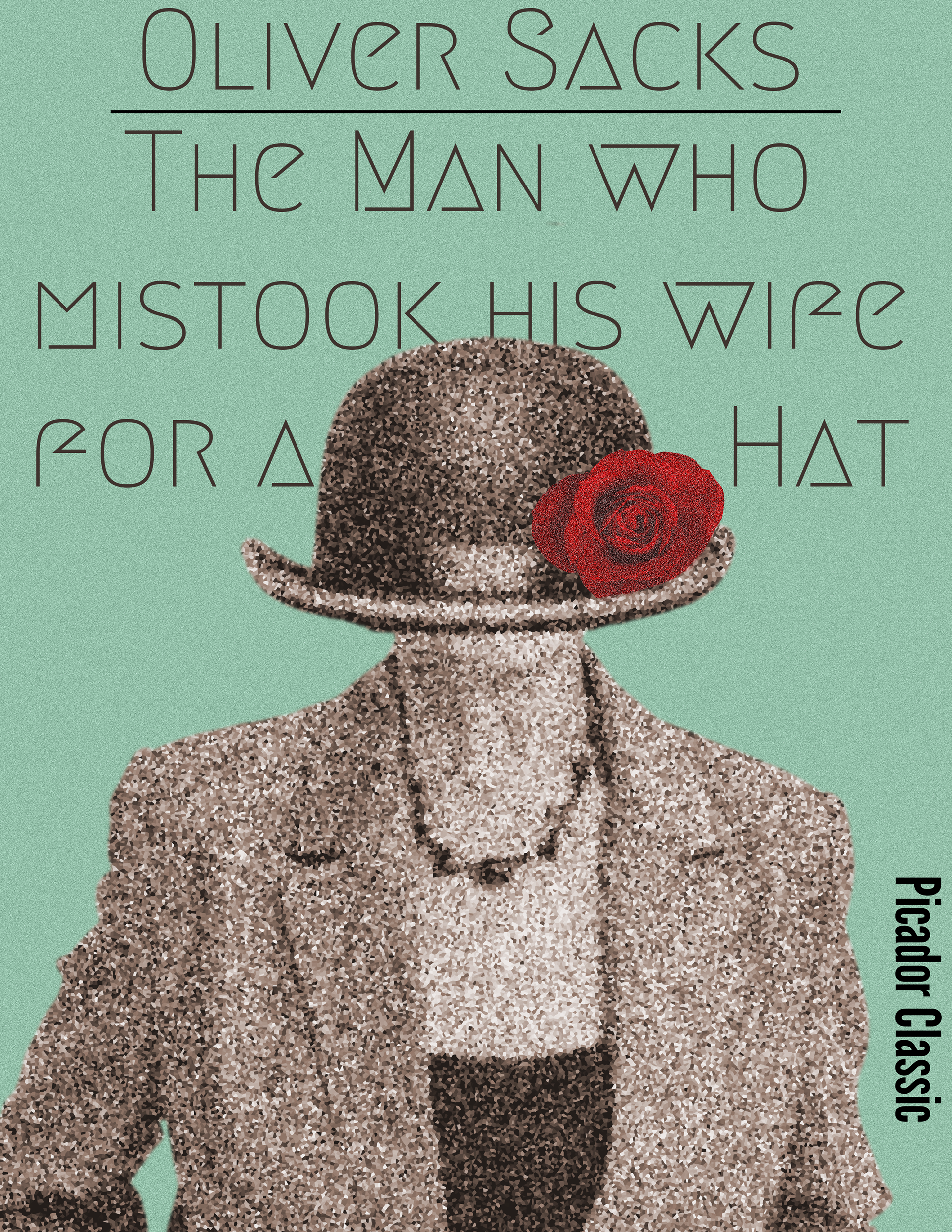
After experimenting with an image I composed of ai, I suddenly got an idea, all inspired by miss peregrine's home for peculiar children. All the pictures until now were of a distorted face. But I never thought to visualise the title. So, after experimenting with that I had quite a vast selection to choose from to make my book cover.
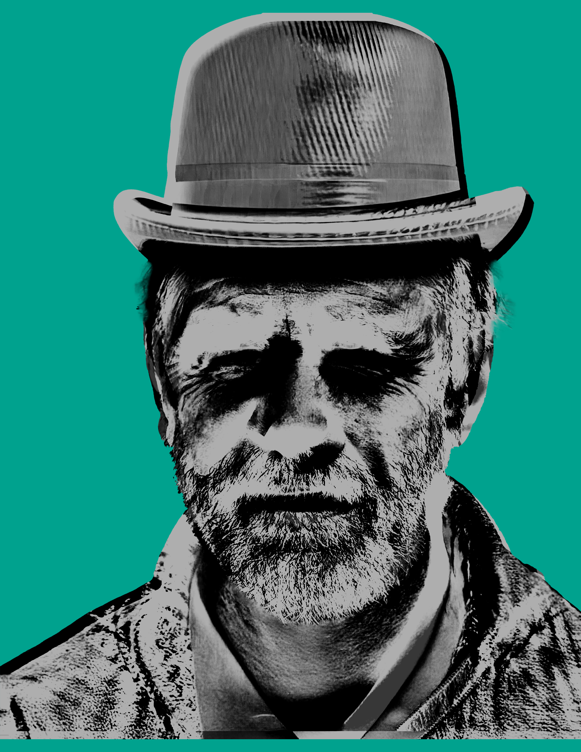


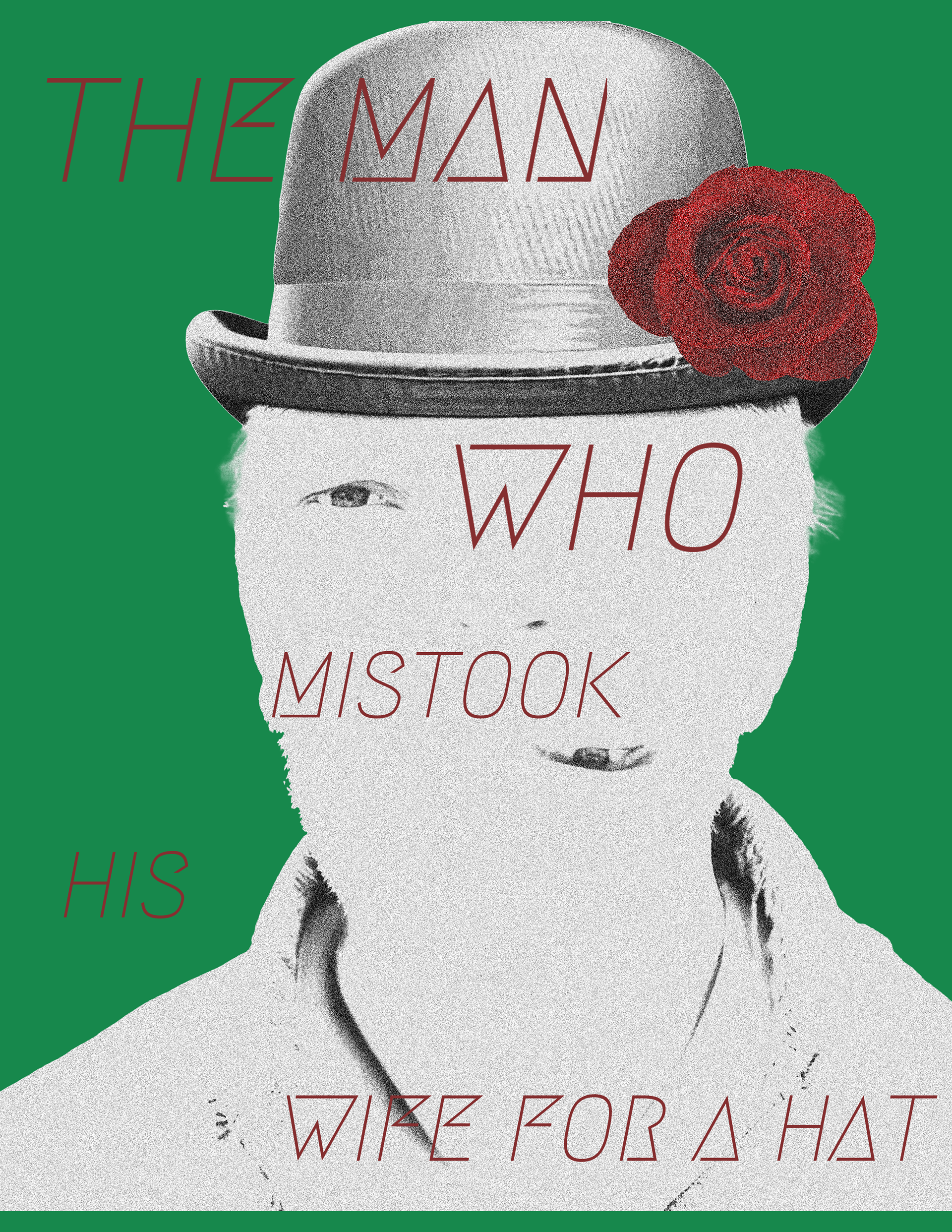
I chose to go with the idea of a woman with a hat for her head. Since I did not have a lot of time, I needed to resource using ai to make the woman instead of taking pictures. I was thinking about doing it the “right way” but after considering the time it would take to find a model, costume, get the photo studio and camera and editing the picture I realise it just is not possible in just a week.

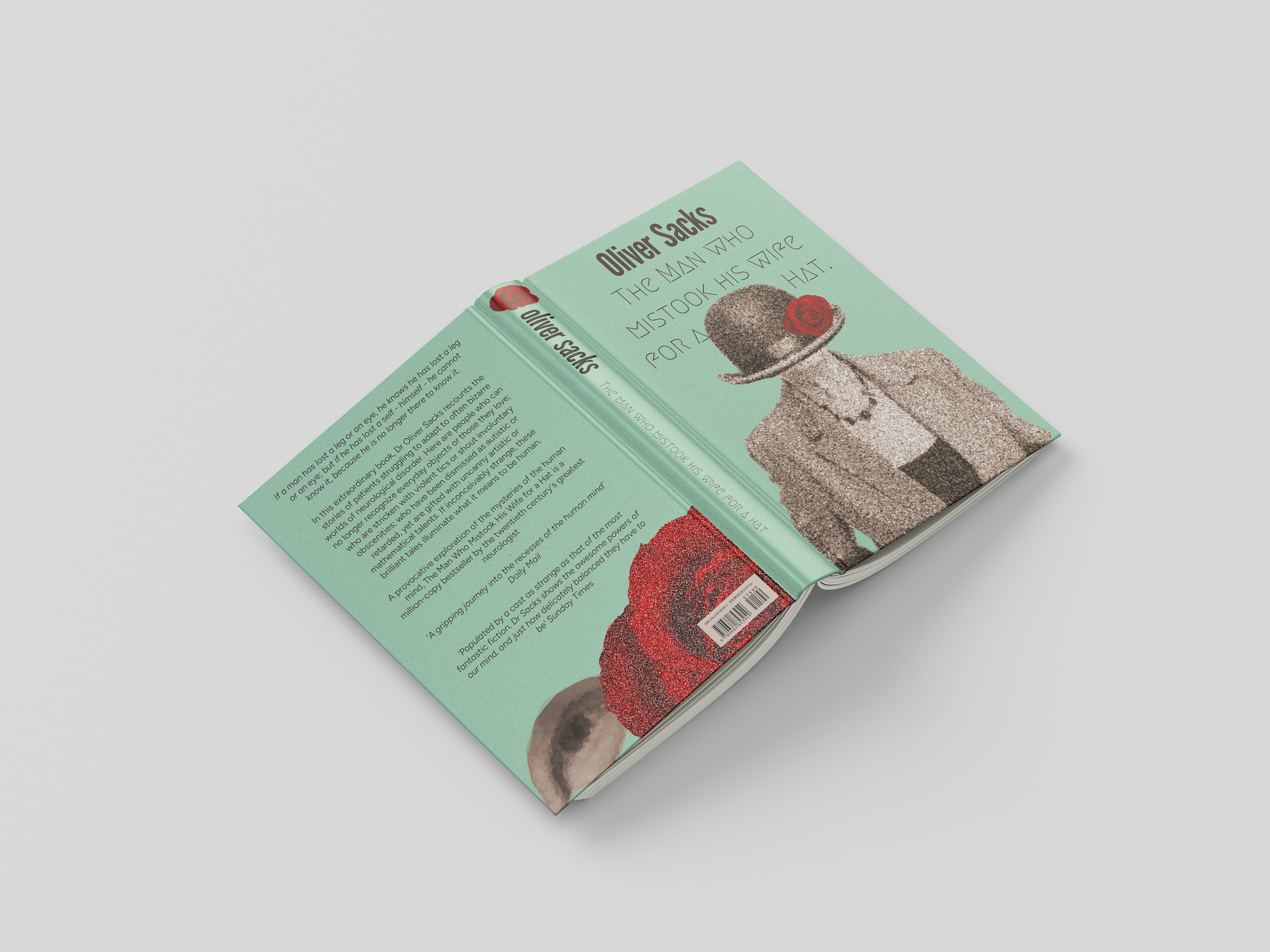
After playing more with the effects I thought that something was missing. And after looking at all my noted I decided to make an homage to something that happens later in the book and added a rose. The rose helped a lot and gave a pop of colour to bring you attention.
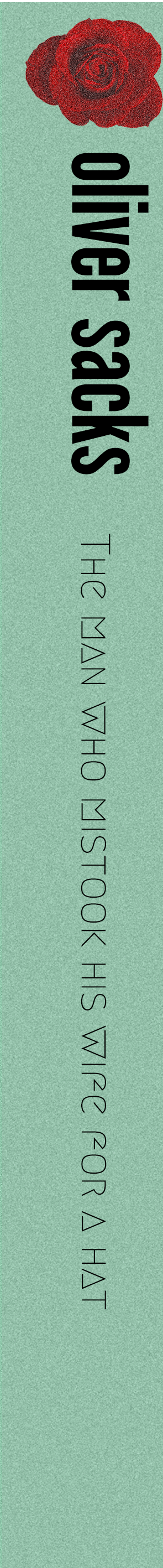
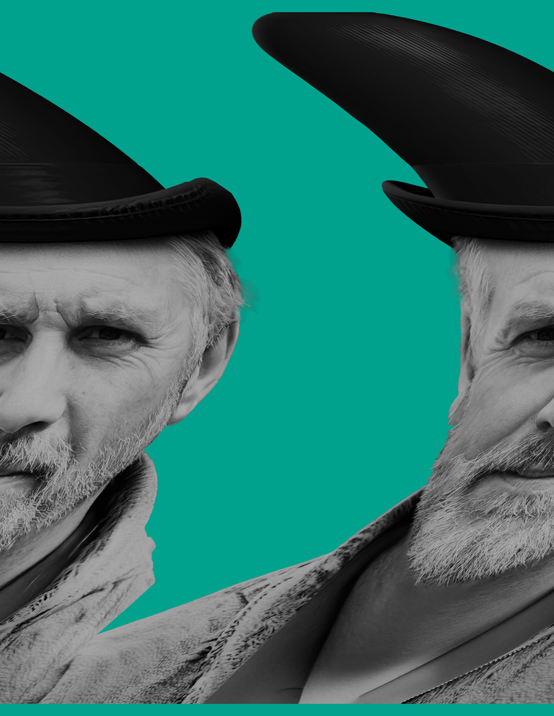
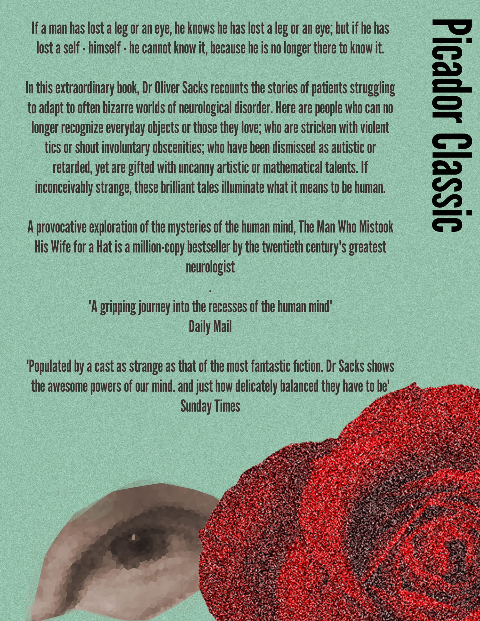
After that I made the side and backside of the book. I made a few sketches for the backside and decided that the rose would tie everything together, so I brought the rose to the back on the side of the book. But the backside was still quite boring, so I picked the idea of a separate eye from one of my first sketches and used it on the backside.
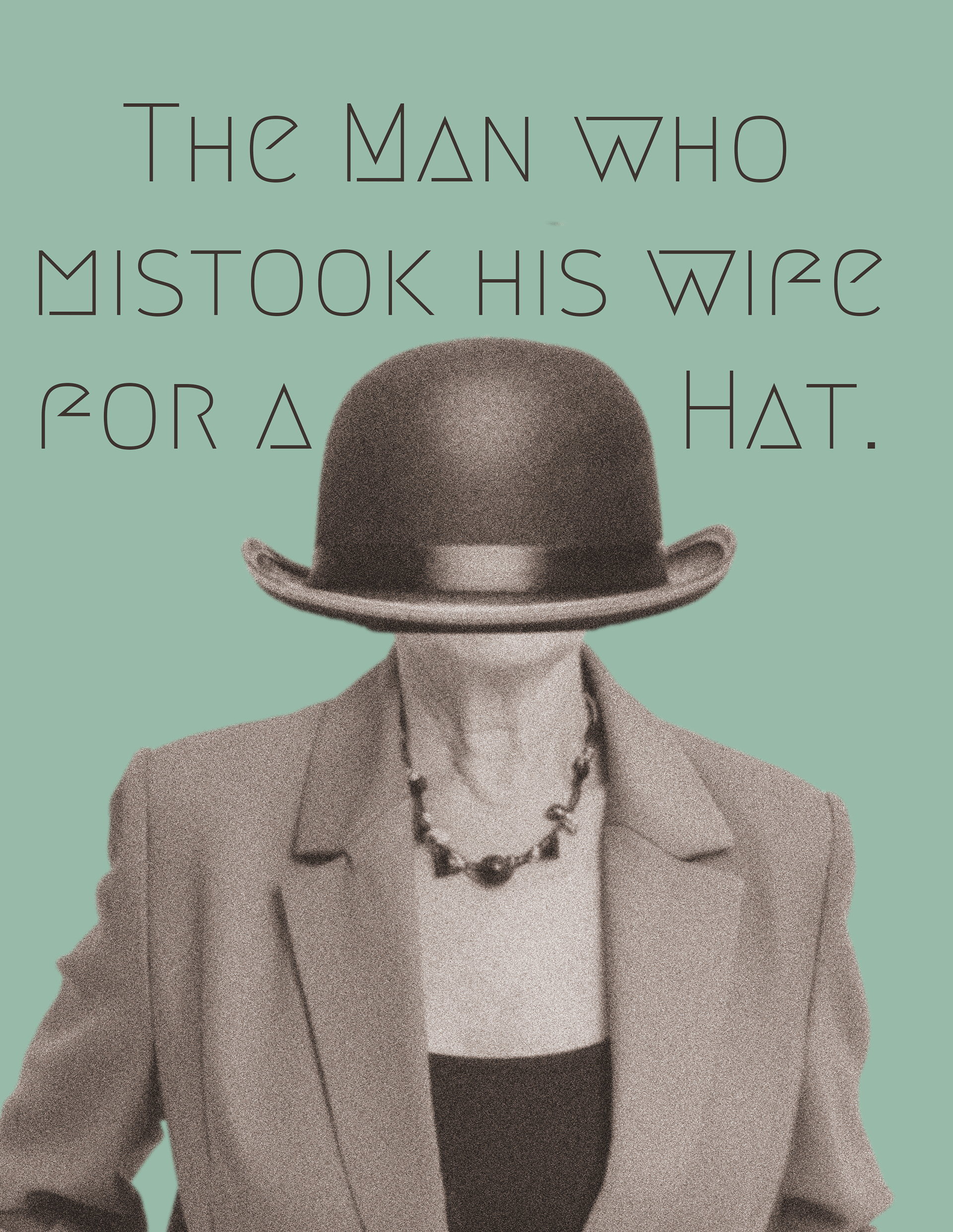
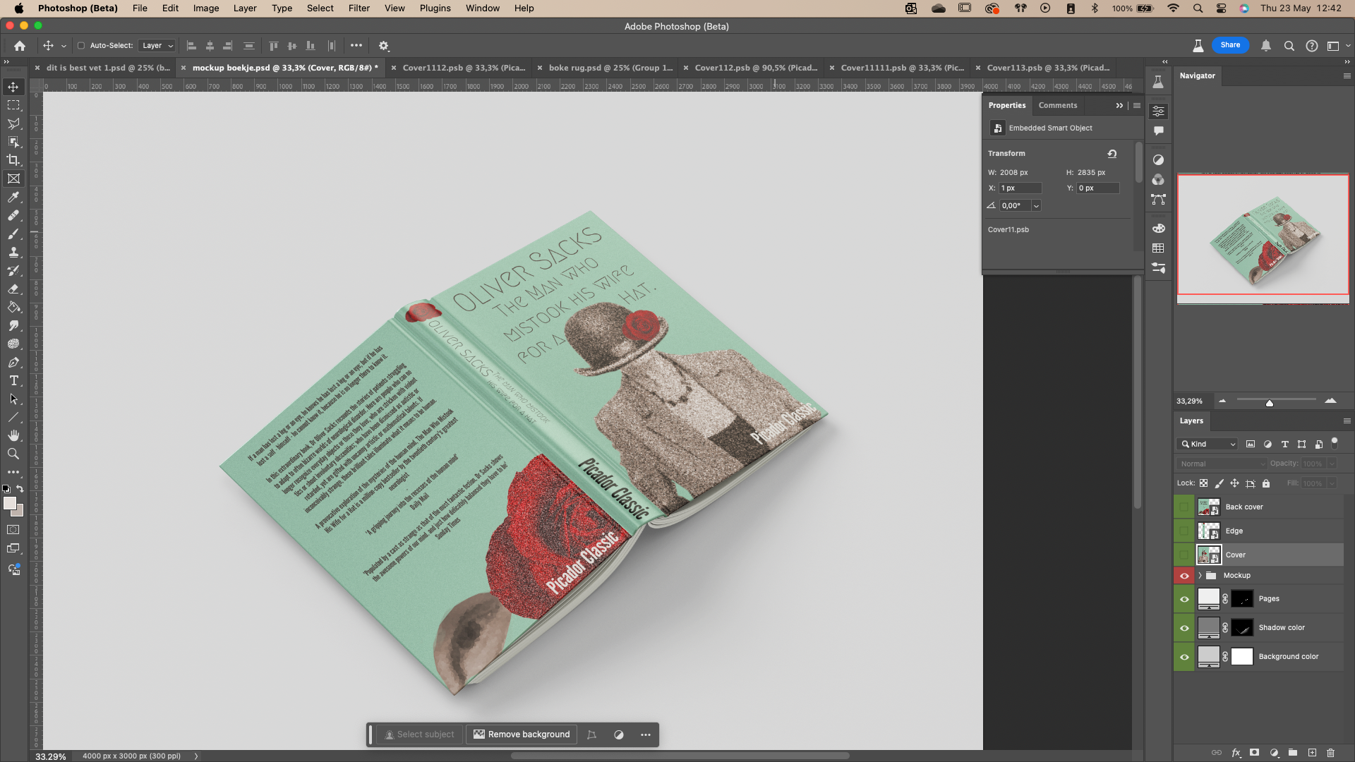
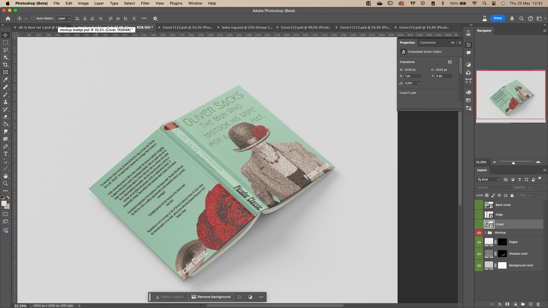
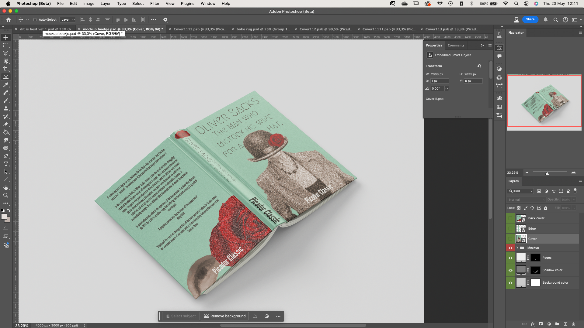
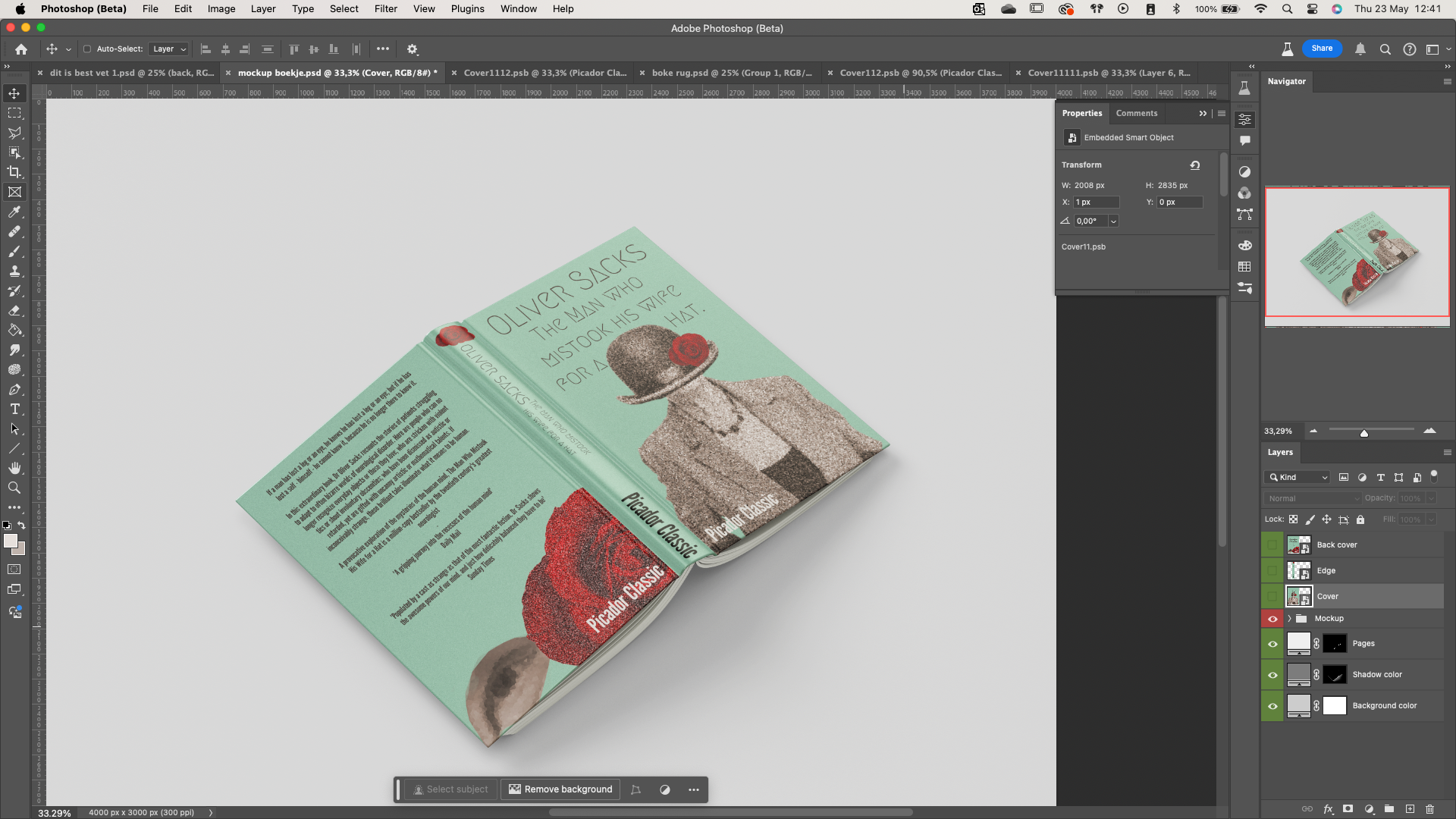
After I thought I was done I wanted to put in on a mock up. But after adding it I realised it was the wrong size. So, some tinkering needed to be done. I also got a lot of helpful feedback I tweaked some more things. One of the things was the author’s name. So, after I made some test for the location and did some consumer test to see the preference of everyone.
This was everyone’s preference:

But then I noticed I got the wrong name and that was the publisher/designers name since in my copy the publishers name is everywhere on the cover. So, I got rid of the names and changed the font and size of the authors name to be more noticeable.


And in the end, I got my final product. I am really proud of what I made and find it a bit surreal that I created this with my own two hands. I really enjoyed it and do not mind making a book cover again. I am happy with the process and the result I got. I got a lot of helpful feedback and am thankful for everyone that helped me.
I learned from this assignment how to implement pictures and edit them to make them fit. I also learned to think about how I will spend the time that I have for a design and how to compromise if it is not manageable.
Overall, I really enjoyed this project. And I hope you can see it in my result.
-Emi Hiraki 24-5-2024